[amazon_link asins=’B07YGQPJLP’ template=’AiPTProductAd’ store=’aiptcomics-20′ marketplace=’US’ link_id=’c4daab2c-f82a-11e8-81a-63c3ec7dce90′]
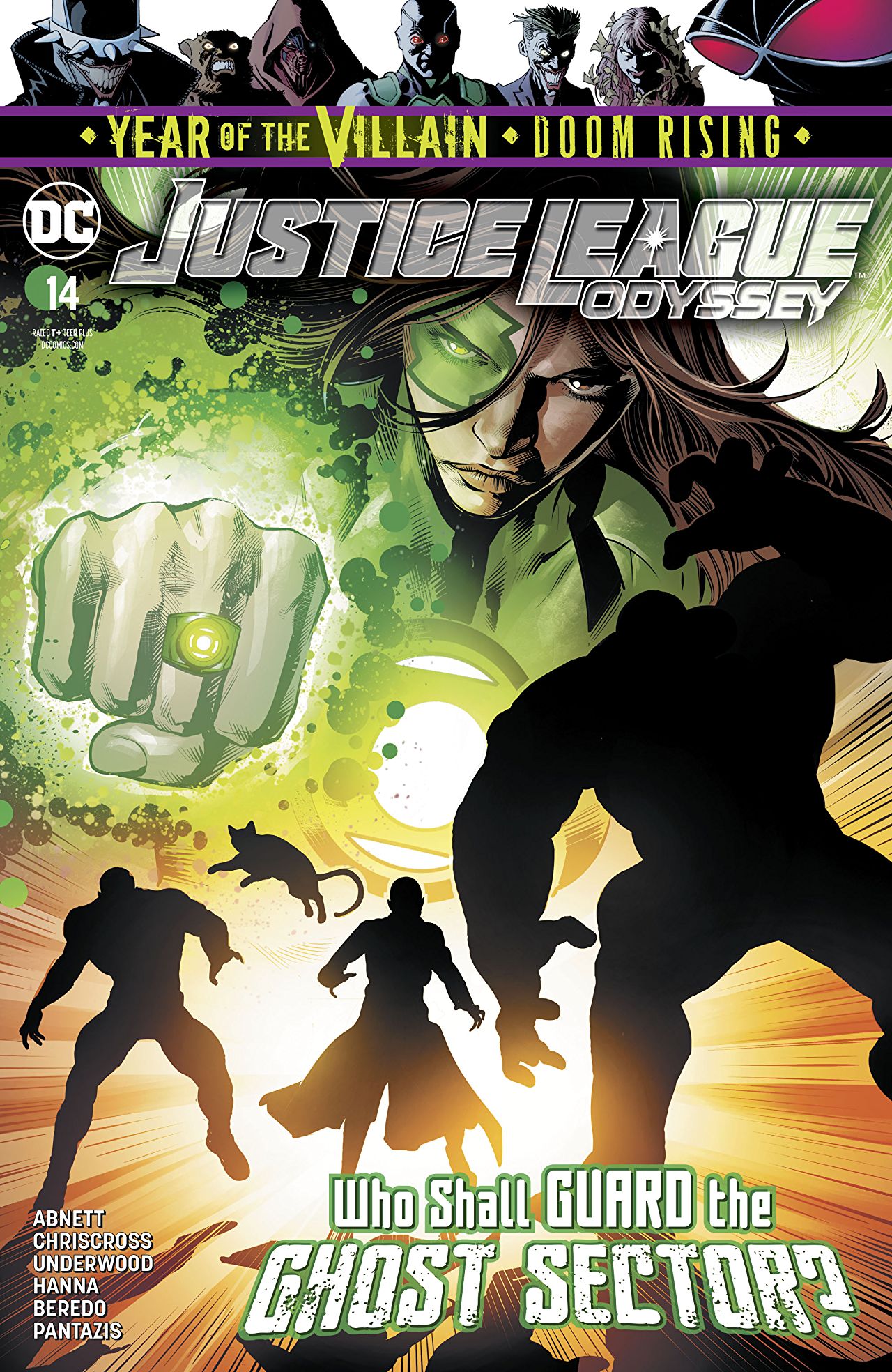
Justice League Odyssey has seen a bit of a revival and a renewal under Dan Abnett. Although he took over early on, a lot of his run has dealt with wrapping up leftover plot threads from Joshua Williamson’s tenure on the title. With #12 being the sort of closing chapter on that era, Abnett, alongside Will Conrad, kickstarted a whole new era for the title with an all-new set of characters, pastiching his own now-iconic Guardians Of The Galaxy team . There was a new flame underneath the title, a new energy, a new set of ideas, a whole new burst of promises. It felt like a dynamic #1 with a clear new mission statement and a striking identity, even on a visual level.

#14, disappointingly, the followup, takes away from that. The established visual identity is instantly broken with this issue, as it’s barely given a second to last, altered and changed in the hands of a brand new art team. But even then, said team isn’t really one penciller crafting the look and feel of the story, it’s two (Chriscross and Cliff Richards), with upto 4 inkers and 2 colorists. And it shows. It really, really shows. There’s something rather deflating about the experience here, as the scope, scale and weight that Conrad (or even Sampere) brought to the title are replaced with artwork that doesn’t quite capture that same cosmic sensibility or tone. And so right out the gate, the issue feels a bit all over the place on a visual level. You can see the flaws in the machine blatantly to the point that you’re not engaging with the story as much as taking note of the problems. It breaks immersion and alters the experience that might’ve been.
It’s hard to put away the idea that the book should not look like this. Conrad’s textured work, which sort of captured the sort of ambiguous war-story tone of the title and story that Abnett’s telling is replaced with a much more simplistic style that feels like it could belong anywhere else, but certainly not in this cosmic story. ‘Out of place’ is perhaps the best way to describe it. To top that off, if Abnett/Conrad’s collaboration had a solid enough handle on the storytelling clarity, where in the beats were delivered as per the intent, this feels…awkward. A scene with Jessica and Okkult springs to mind immediately. The moment is meant to have Jessica make a hard point and take charge, but what should be an awesome moment comes off as odd and unclear, as it feels like the beats were stuffed into one another, without the room to actually land the way they’re supposed to. If the reader is meant to walk away with awe or a grin, they come away more so remarking on the awkwardness of the storytelling. Things such as double-page spreads, which in previous installments, evoked awe and wonder, now land with a whimper and lack any of the meaningfulness. They confuse the reader’s eye more than carefully lead it. The experience isn’t a smooth flow as much a stream of confusion.

This is very clearly the issue 2 to #13’s issue 1 and there’s certainly that ‘transitional’ vibe present here, as the book’s gotten it’s basic 101 out of the way in the first one and it’s now elaborating on some of the things, clearing up some questions and really laying out all the cards on the table, so that #15, the issue 3 can really blow the top off the roof. But the momentum of the book thus far, especially that which was achieved in the previous issue, is lost here, as it feels like the book stumbles here. The book, more than ever, needed consistency here, rather than elements that distracted or broke away from the story. That’s been a key problem, in one form or another and so it’s hard not to feel disappointed with this installment of the series, which looked to be picking up so much steam earlier.

That aside, this is the issue with the big revelation about Okkult, our Not-Star-Lord, if you will. And it also proves to be a deflating reveal. It is an existing character and it is very much a obvious pick and so there’s that wave of disappointment that passes over, making one go ‘Well, you could’ve done something more out there, less obvious’. But to be entirely fair to the work, it’s a reveal that is consistent with its story, promise and ideas. It makes sense for what it is going for, but at the same time, it feels like the safest choice. It tracks that the book would want to use that character, but even a choice such as Vril Dox may have been much more interesting, playing into the book’s other setup idea, Brainiac and his legacy fighting down and stopping Darkseid’s plans. There were much more potentially interesting routes here, including the character being an all new original addition to the DC mythology. But nevertheless, as a fan of the character that is beneath that mask, it is nice to see them pop up once more and perhaps be relevant in a narrative again.
Colorists Rain Beredo and Pete Pantazis, as well as the lettering group Andworld Design do their best with what they have, but it really does feel like a struggle, where in the entire crew is rushing in the absence of a singular artist and trying to get the issue out more than anything else.
Justice League Odyssey #14 really struggles here, as it transitions from the strong debut of its new mission statement, to whatever the future holds. The lack of a clear, consistent, cohesive visual identity may just be the biggest flaw in the book’s design to date and unless that is resolved, with a collaborator who stays with Abnett and fits his ambiguous war story tone, the book will continue to struggle.
Join the AIPT Patreon
Want to take our relationship to the next level? Become a patron today to gain access to exclusive perks, such as:
- ❌ Remove all ads on the website
- 💬 Join our Discord community, where we chat about the latest news and releases from everything we cover on AIPT
- 📗 Access to our monthly book club
- 📦 Get a physical trade paperback shipped to you every month
- 💥 And more!


You must be logged in to post a comment.